
How to have a career
Urban Agglomeration Economics, Labor Markets, Networking, and what it means for you

I’ll start this story with some biographic motivation. I was born and raised on Chicago’s tony North Shore. When I introduce myself, I’ll often use the classic John Hughes movie ‘Ferris Bueller’s Day Off’ as a reference because it, along with all of Hughes’ other films, took place on the North Shore as did Mean Girls, Risky Business, and pretty much every other high school movie made in the past 40 years.

Growing up, many of my family members and friends’ parents worked in the professions as business executives, lawyers, accountants, bankers, and financiers. However from an early age, I showed an interest in and aptitude for tinkering with machinery. I would take apart bikes and skateboards and nerf guns and computers and radios and put them back together. I taught myself computer programming from books from the public libraries, I loved physics class in middle school and high school and was guided towards engineering. I ended up studying mechanical engineering at the University of Illinois Urbana-Champaign.
My first engineering job out of school brought me not to Chicago or its suburbs, but rather to a diesel shop in rural Northern Indiana. The new lifestyle was different, new, and unexpectedly enjoyable. It quickly became clear that the world of my suburban upbringing simply wasn’t compatible with the career I had chosen. Many of my classmates from Illinois had gone into consulting or finance and were living and working in downtown Chicago. Why is it that there weren’t engineering jobs there, or at least not worthwhile ones like hands-on engineering R&D? Why did I move twice to grow my career in the auto industry while my accountant cousin simply went to a different building in the Loop?
Attempting to answer these questions led me on a years-long deep-dive into how urban economies function and how this, in turn, affects labor markets.
Urban Agglomeration Economics
The thinker most responsible for my understanding of urban economies and how they relate to one another is Saskia Sassen. I’ve stanned Sassen before on this blog, but I’ll recap her ideas once more. Sassen’s main observation was this: starting in the 1970s and 1980s, modern telecommunications allowed money and information to flow very easily and quickly across the world so businesses and industries would have all their core functions located in one geographic area. This created very specialized, capable, and hyper-local pools of labor in these nodes of global commerce she called ‘Global Cities’
In her own words:
those specialized service firms engaged in the most complex and globalized markets are subject to agglomeration economies. The complexity of the services they need to produce, the uncertainty of the markets they are involved with either directly or through the headquarters for which they are producing the services, and the growing importance of speed in all these transactions, is a mix of conditions that constitutes a new agglomeration dynamic. The mix of firms, talents, and expertise from a broad range of specialized fields makes a certain type of urban environment function as an information center. Being in a city becomes synonymous with being in an extremely intense and dense information loop. (https://www.columbia.edu/~sjs2/PDFs/globalcity.introconcept.2005.pdf)
This is from the intro to her book, “The Global City” Both the intro and the book are well worth the read. Most people intuitively know this concept to be true. If someone wants to work in finance, they move to New York, if they want to be an actor they move to LA, if they want to work in Oil and Gas they move to Houston, if they want to work in software, they move to the Bay Area etc. Sassen laid out the theoretical framework for the mechanism that drives this phenomenon. I experienced this first hand in the negative sense; I chose a career that was not a good match for my geography. In the globalized, connected world, you either pick a city and are assigned a career or you pick a career and are assigned a city.
I was curious to see if I could quantify these trends in economic data to back up the intuition we all have and the theory that Sassen developed. Various agencies and bureaus in the federal government publish economic statistics annually to describe the population and the economy of the country. I’m going to try and keep the jargon minimal, but there will be many abbreviations that pop up. For brevity’s sake, I’ll use them but I’ll try to use as few as possible.
Economic Statistics
The US Census Bureau has divided the country into 387 Metropolitan Statistical Areas or MSAs. From the Census Bureau’s website, “The general concept of a metropolitan or micropolitan statistical area is that of a core area containing a substantial population nucleus, together with adjacent communities having a high degree of economic and social integration with that core.” In short, they are the urban areas around a city and I’ll call them MSAs or cities in this essay. Many of the economic statistics I worked with are tabulated for the US as a whole, by state, by MSA or occasionally by county. I think MSAs are the correct division for analyzing economic differences because the city — not the state or country — is the geographic unit of economic production. For the following analyses I looked primarily at MSA-level data and compared it to the US metropolitan data as a whole.
GDP
I started with the CAGDP2 dataset, published by the Bureau of Economic Analysis (BEA). CAGDP2 tabulates the contributions to MSA Gross Domestic Product (GDP). GDP is a statistic used by the BEA to keep track of economic activity. “The value of the final goods and services produced in the United States is the gross domestic product. The percentage that GDP grew (or shrank) from one period to another is an important way for Americans to gauge how their economy is doing. The United States' GDP is also watched around the world as an economic barometer.” To estimate how much of an MSA’s economy is biased toward a certain sector, I added up all the relevant rows and then found the percentage breakdown of each sector. I then divided that fraction by the fraction of the United States as a whole to create a ratio of each sector’s contribution to an MSA’s GDP to that of the US. This ratio indicates how biased a local economy is towards or away from a certain sector. I wrote a simple python script to perform this calculation for every sector and MSA and tabulated the results.
This table shows the 25 largest MSAs and their 2022 GDP, and the sector of the economy that had the highest MSA to US GDP ratio. This is not necessarily the sector with the largest component of the MSA’s GDP, but rather the sector that had the largest contribution to a MSA’s GDP when compared to that same sector’s contribution to the GDP of the US as a whole. In other words, what is the most outsized component of this city’s economy?
This is the formula I scripted to generate this table.
The scripts used to generate this table are on my GitHub.
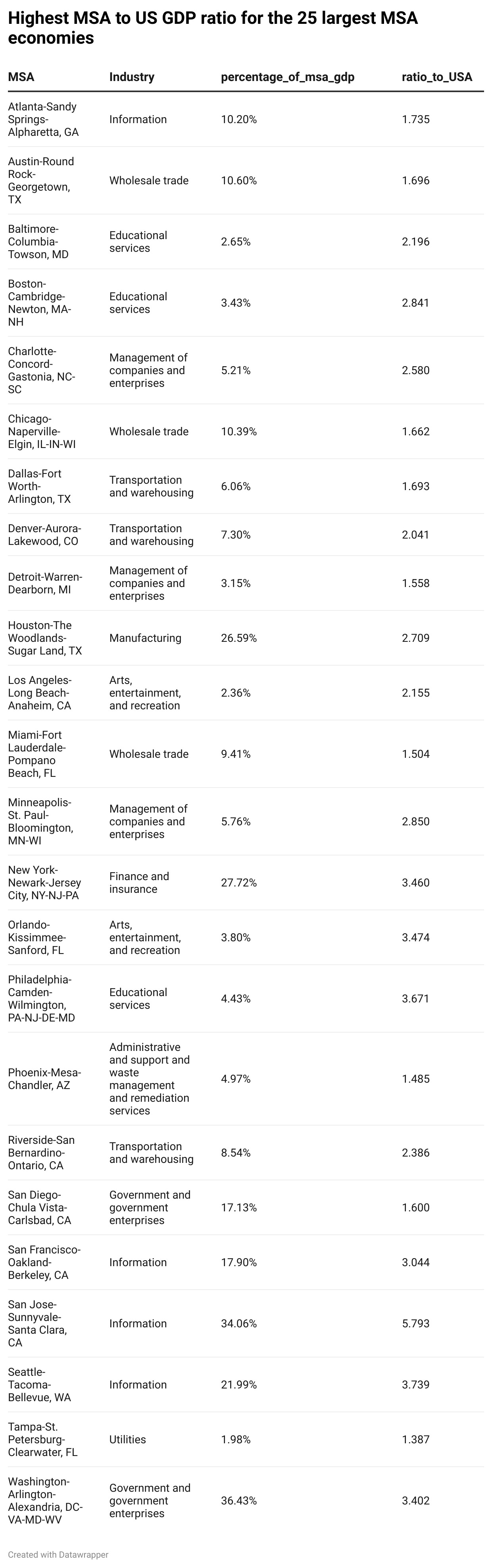
The findings match both Sassen’s theory and my intuition of how agglomerated urban economies function. Software domintaes in Silicon Valley, San Francisco and Seattle. Finance and Insurance dominates in New York. Government dominates in Washington DC. Arts and Entertainment dominate in LA and in Orlando.
Specific industries tend to cluster geographically, develop a highly specialized, highly skilled workforce to create a competitive advantage over other regions and have outsized economic output. Excellent. But what does that mean for the local labor markets? What does that mean for the new college grad looking to start a career, a jobseeker looking for a mid-career pivot, or an entrepreneur looking to select a location for their new business? To answer these questions, I ran a similar analysis on a different dataset.
Employment Ratio and Wage Ratio
A different part of the Federal Government, the Bureau of Labor Statistics or BLS, estimates the number of jobs in every MSA in the Occupational and Employment Statistics (OES) dataset.OES reports the median wage along with the 25th, 75th, and 90th wage percentiles. Like the CAGDP2 dataset, OES is broken up into large categories and those are further subdivided into 830 individual occupations. For my analysis, I stuck to the larger occupation groups and used the median annual wage as the metric. Like with the CAGDP2 dataset, I added up the total number of jobs in each category and then calculated the fraction of employment for each sector, for each city. I then divided it by the employment fraction of the United States as a whole to get the MSA to US ratio.'
Here is the formula I used to calculate the MSA to US employment ratio
If Sassen’s theory and my intuition are correct, then a higher MSA-US employment fraction ratio of a certain sector will be associated with higher wages in that sector. Because the OES dataset also has wage information, I can perform a similar calculation for the median annual wage. However, each MSA has a different cost of living so to accurately compare wages across MSAs, I’ll need to do a cost of living adjustment. Luckily BEA has a handy statistic I can use called the Regional Price Parity or RPP
Like the other economic statistics from BEA and BLS, RPP is published annually with MSA-level resolution. I wrote another python script to extract the MSA-level occupation groups, adjust the median wages according to the RPP and then calculate the MSA-US ratio for adjusted median wage. Now that I have employment fraction ratios and median annual wage ratios for each MSA, I can compare the two across each MSA in the dataset. For this analysis, I stuck to the 50 largest economies in the country as they are collectively responsible for just over 55% of all economic activity and would be less susceptible to large outliers.
This is the formula I used to calcuate the MSA to US wage ratio:
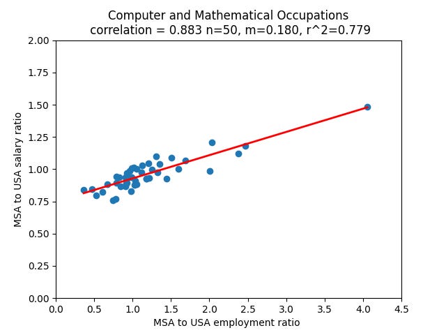
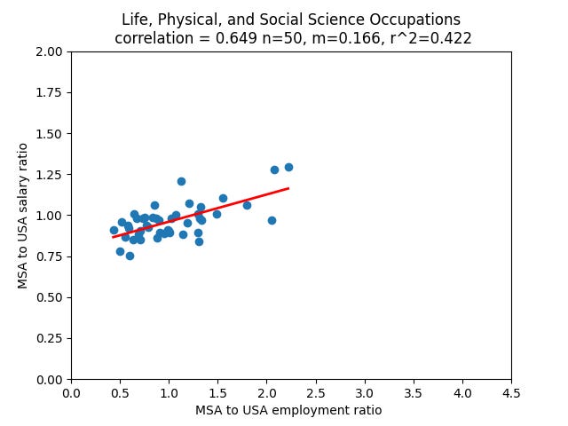
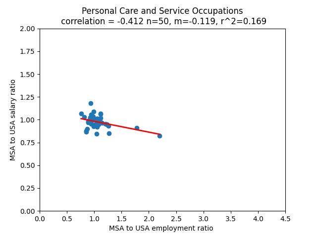
For each major occupation group, I plotted the MSA to US wage ratio against the MSA to US employment ratio for the fifty largest cities in the US. Each point in the scatter plot corresponds to one MSA. I then calculated three statistics for each occupation category. First is the correlation coefficient. The correlation between the wage ratio and the employment ratios indicates how closely the two vary for each occupational category. A correlation of 1 means that they two increase in lockstep, a correlation of -1 means the one increases as the other decreases and. The other two statistics, slope and r^2, come from a least-squares linear fit of the dataset. The r^2 value measures how closely the points fit to a line and the slope indicates the slope of that line. These are two different ways of measuring more or less the same thing: how closely the two ratios are related to one another, and whether that relation is positive or negative.
As with the CAGDP2 dataset, the scripts used to create the table and plots are on my GitHub.
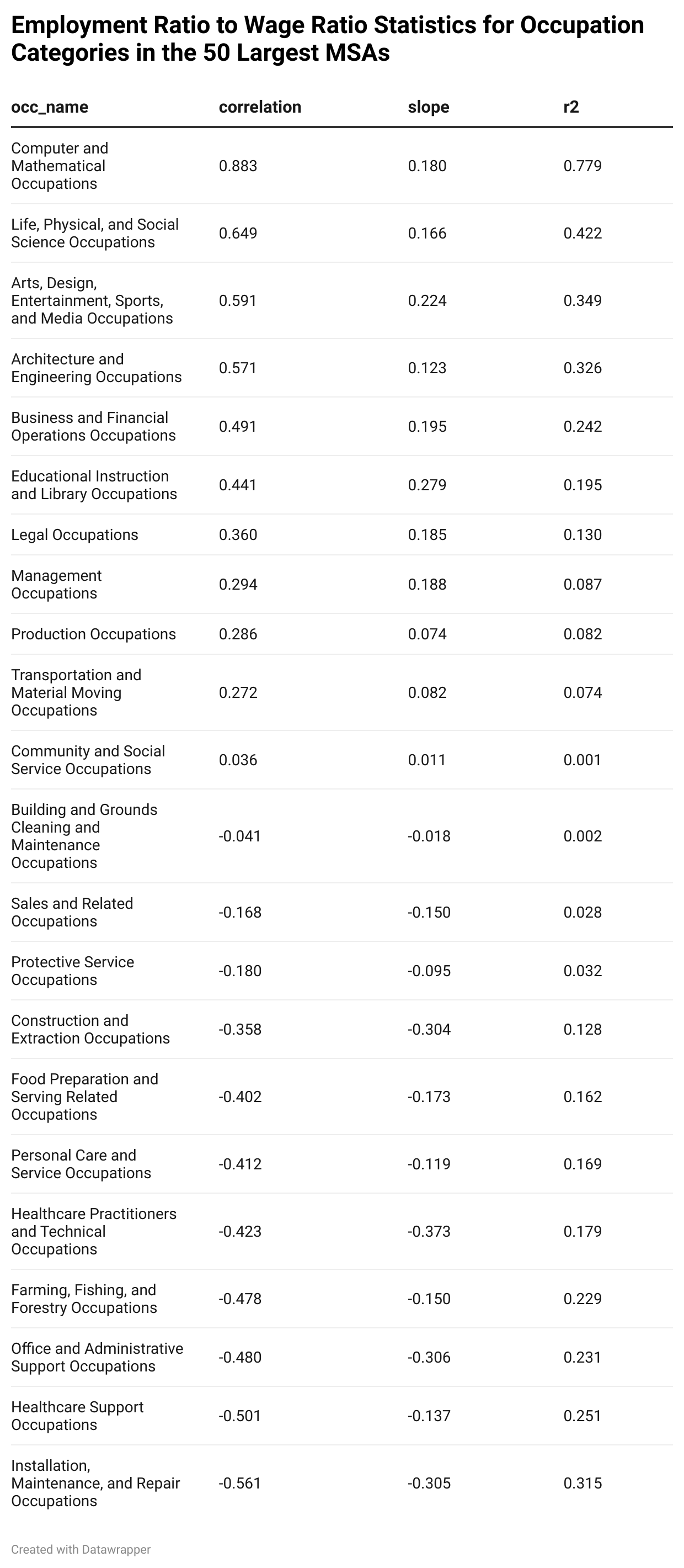
The results are fascinating. As expected, there is medium to strong correlation between wages and employment fraction for the professions: Finance, Engineering, Software and management. This fits perfectly with Sassen’s urban agglomeration theory and is somewhat counter to the ECON101 notions of supply and demand. A larger supply of software engineers means that there is correspondingly more demand which drives up wages?
However for the occupations groups outside of ‘the professions’, there is a negative correlation between employment fraction and adjusted median wage. This looks a bit more like ECON101 supply and demand. The more ___ workers you have in an area means that there is more competition, and therefore downward pressure on wages for jobs in those occupation groups. I don’t want to speculate too much on causality because there are almost certainly a whole host of unmeasured confounding variables in these datasets. And to paraphrase the Taleb, exposure is more important than complete knowledge.
I did the analysis using the 50 largest labor markets in the USA compared with the top 25 used in the CAGDP2 analysis. I was surprised to find how reliable the trend was across a larger sample set. The difference across occupation categories was surprising to me. The professions show a positive correlation between employment fraction ratio and salary ratio, the occupational groups that are more associated with commoditized labor showed a negative correlation and support roles like social work and landscaping were nearly perfectly decoated.
Here are a few of the plots:
Economy - Career Fit
So what does this mean for you, the local economy participant, the job seeker or the otherwise curious observer? When I was looking to advance my engineering career, I voraciously read as many forums, books and blog posts as I could. The most sage advice came from the Wealthfront Engineering blog. [https://eng.wealthfront.com/2014/02/20/career-planning-for-new-grad-and-young-engineers/]
In this post, the wealthfront engineering team offers the following advice:
Go to the epicenter
Build stuff that matters
Focus on your passion
Find a great mentor
Ignore company size
Avoid companies with silos
I followed the advice. It worked. I think the first point could be expanded though. Because we know that cities are the unit of economic production and professions are subject to urban agglomeration economics, I think a better way to phrase the first point is ‘achieve economy-career fit.’ The CADGP2 and OES datasets show that each city specializes in one or more industries or sectors and that there is a wage premium for working in the dominant industry in a city. Economy-career fit is matching your skills, your abilities, your interests, and your training to your geography. Economy-career fit is what I was missing when I was building an engineering career in Chicago. It would be like trying to train for the winter Olympics in Miami. Not impossible, but you’re not going to have an easy time.
What is interesting is that outside the professions the opposite seems to be true. And this holds for medicine too. If you want to have high earning potential as a doctor, the best thing to do is to move away from the other doctors. Strange.
All Hiring is Local.
I have a yet-to-be published essay about the history and purpose of universities, but I’ll give away the punchline here: the primary purpose of universities is job training. It always has been and it always will be regardless of what people who work at them, fund them, or send their kids to them claim. Universities train workers to participate in the economic. Companies hire from universities.
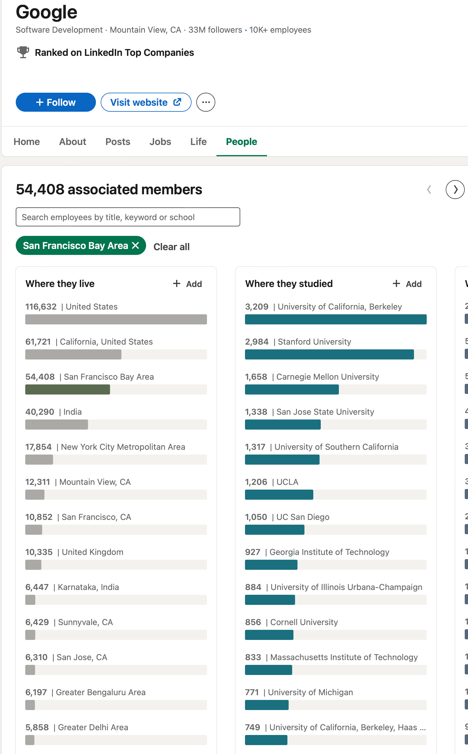
When planning a job change I made about 4 years ago, I spent hours looking through LinkedIn to see the backgrounds of engineers who worked at companies I was interested in. LinkedIn has a cool feature where you can select a company, sort by function or geography and see what employees match those criteria. This feature is sort of like a pivot table in Microsoft Excel and it allows you to see a rough breakdown of which schools employees at each location and company went to. As I pored over these profiles for companies, I began to notice something unexpected: when I filtered people by location, the universities that they attended seemed to be in descending order in terms of proximity to the office.
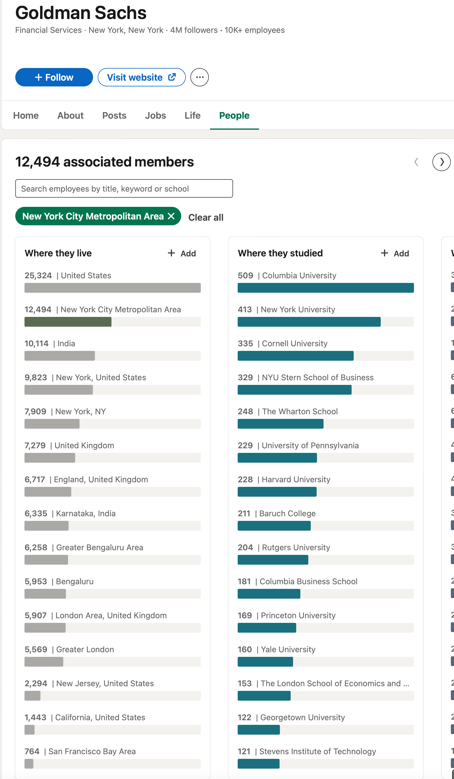
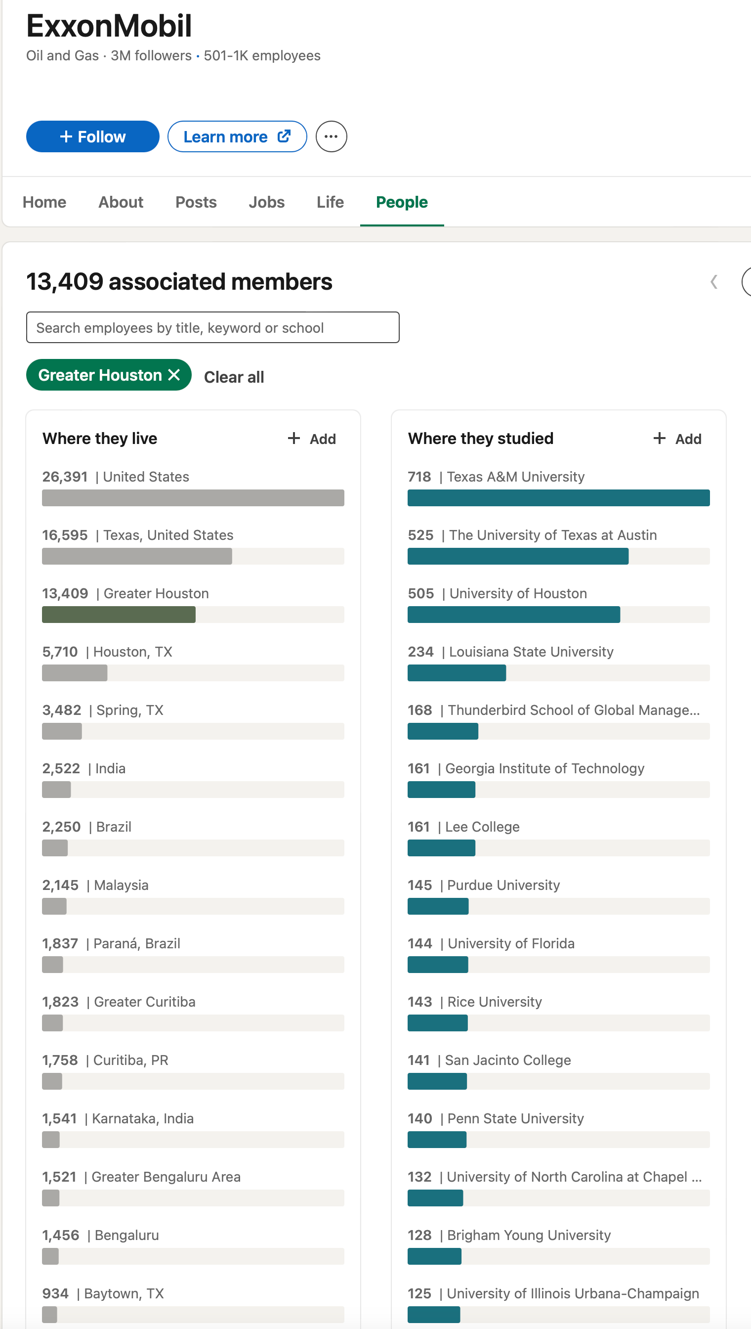
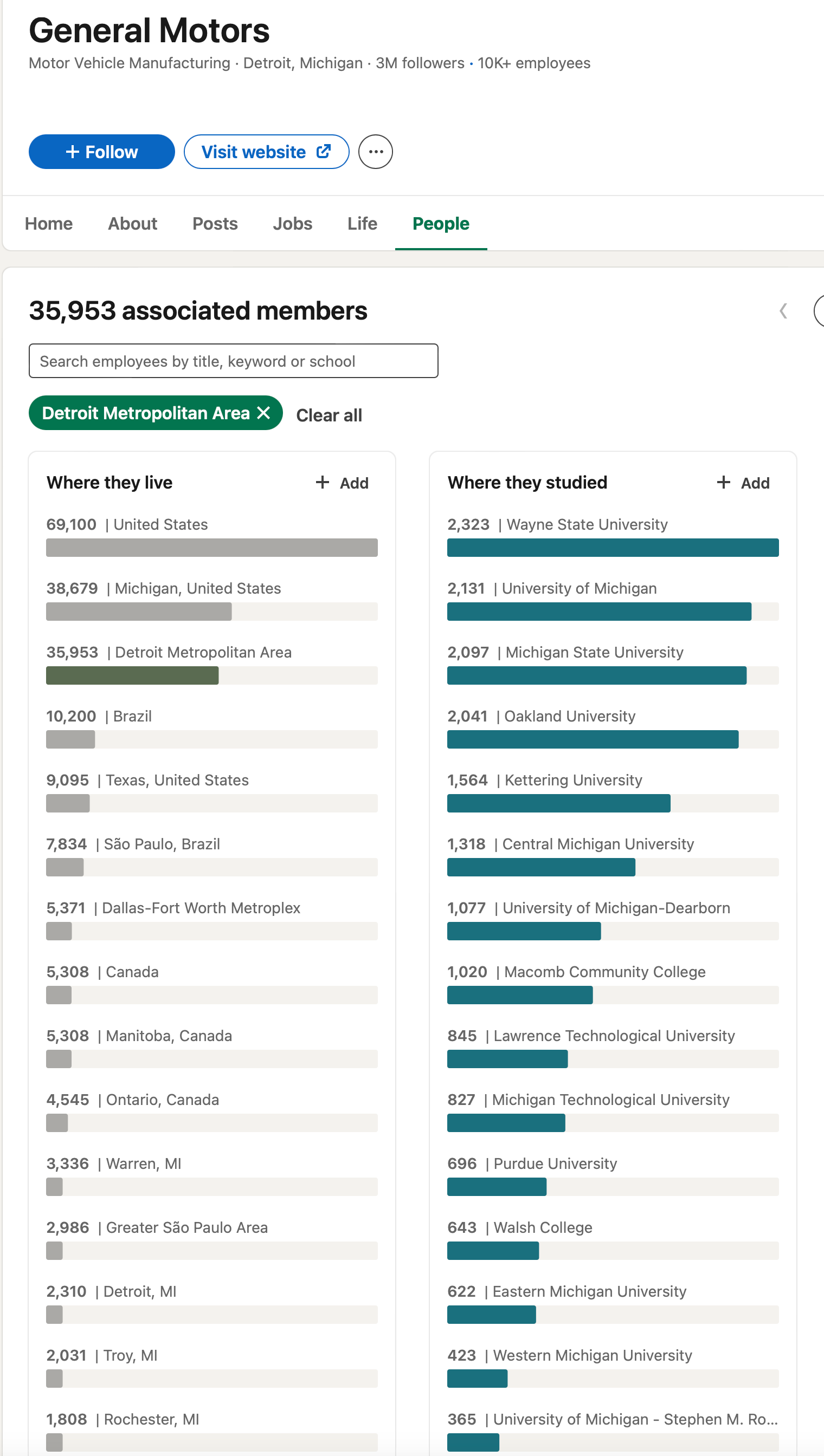
I was operating under the assumption that companies want to hire the best people from all over the country and, therefore, recruit nationwide. I especially thought that this would be true at the industry leading, so-called ‘frontier firms’, but the data from LinkedIn seemed to indicate the contrary. Company after company in industry after industry showed that the plurality of employees came from universities located close to the companies office. All hiring is local. Due to my limited access to the LinkedIn users dataset, this analysis is not as rigorous as that which I performed on the CAGDP2 and OES datasets but it still highlights a counterintuitive trend. @LinkedIn, please give me a research API key. There are likely some significant biases in this dataset, as it is dependent on users who sign up for LinkedIn. I’d guess it skews younger and more towards the tech, engineering and finance crowd, but I have no reason to believe that there would be major sampling bias within the user base. Even at the so-called ‘frontier firms’, there is a very strong local hiring bias. See these examples below:
When you filter for the Bay Area, 6 of Google’s top 7 feeder schools are in California with the top 2 being in the Bay Area
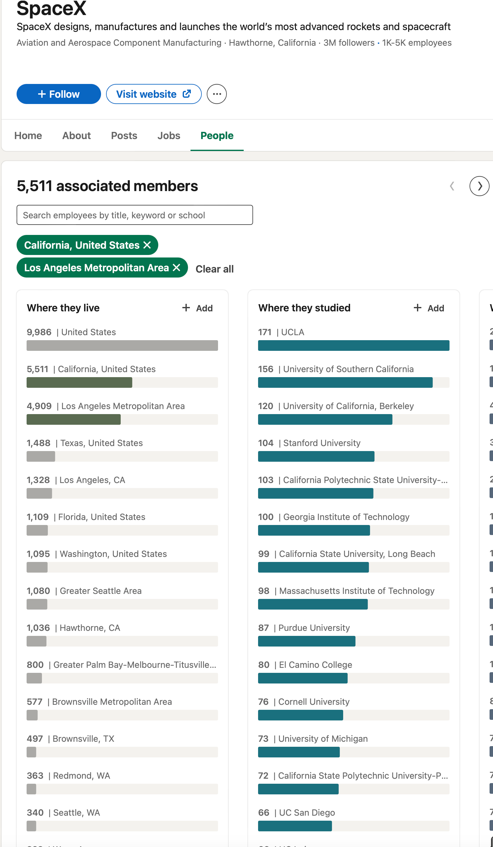
Similar story with SpaceX and LA.
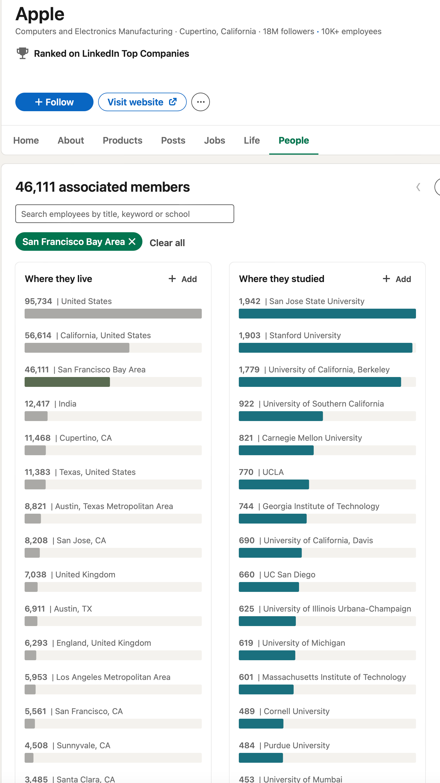
And with Apple in the Bay Area
And for Goldman Sachs and the New York area schools. An interesting thing to note is that there are more Rutgers grads than Princeton grads at Goldman.
Exxon hires from schools in the Houston area:
GM hires almost exclusively from Southeast Michigan
This trend is incredibly strong. I’m not going to speculate too much on causation. It could be companies don’t want to pay relocation, it could be that people don’t like moving, maybe the universities have relationships with the companies. I’m not sure. And again, the causal reason does not need to be established for you to take advantage of the correlation.
I encourage the interested reader into running this test for themselves. I’ve found that the correlation is even stronger for government agencies which is pretty interesting.
All hiring is local. If you know you 100% want to work for a specific company or in a specific industry, it doesn’t hurt to go to school right next to the office.
Networking
The first step to having a successful career is achieving economy-career fit. This puts you in a dynamic skilled and deep labor pool. As Sassen states, “Being in a city becomes synonymous with being in an extremely intense and dense information loop.” Tapping into this dense information loop is crucial to building your career. Learning about new opportunities and connecting with new people goes by the name “networking” in common parlance.
When I was introduced to the concept of networking in college, it was always in the context of some stodgy career fair where everyone wears ill-fitting, salariman suits and stands around in a gymnasium. Like any reasonable person, I was repulsed by the whole scene.
Luckily, the university career fair is the most contrived and artificial version of networking. True networking is simply meeting up with people who have the same interests and geeking out about your shared passions. As I touched upon in an earlier piece, the internet and social media has inverted the order in which people meet and exchange ideas. When I was in college and starting my career, it was customary to meet people in person and then later connect online. This now happens in the opposite order; I’ll interact with someone online and then later meet up in person.
I’ve had great conversations and have made worthwhile connections both online and in person but I think it’s important to be aware of the bizarre social media dynamics like filter bubbles, dogpiles, audience capture, and all kinds of other pernicious dynamics that only happen online. The map is not the territory; the internet is not real life. Get out there and meet people in real life.
One of the more counterintuitive trends I’ve found in my networking experiences is the higher someone is in the org structure, the more likely they are to respond to a cold email or dm. Individual contributors or middle managers almost never respond, but CEOs, COOs, VPs or others in high positions respond at much higher rates. I’m not exactly sure why, but my best guess is that the higher one is in a company, the more time is spent talking to people outside of the company like customers, investors, and potential hires.
“To Thine Own Self Be True”
There are a series of major shifts happening simultaneously in my corner of the industrial/manufacturing/tech economy. With these shifts, come an incredible amount of opportunity. Companies are always looking for capable, talented, and interested people and it ultimately comes down to what you are looking for out of a job, out of a career, and out of life more generally. There will always be more to do than can ever be done so focusing on what you are skilled at and interested in will make the whole process smoother and worthwhile. The reasoning behind this post was mostly developed when I was going through a job hunt a few years ago. I came to the conclusion that I would either have to switch careers to stay in the Chicago area, or switch locations if I were going to stay in engineering. Ultimately, I ended up moving to the Bay Area to further my career in engineering and technology rather than staying in Chicago and pivoting to finance, consulting, or some other generic business role.
I’ve been here in the Bay for a little over three years in and it’s worked out reasonably well. I’ve taken advantage of the much deeper job market for engineering and tech and met many incredible people working on fascinating problems. Having the same career trajectory in the Chicago area would be nearly impossible, so for that reason alone the move was worth it. However, each person’s situation is different. I didn’t have any big commitments keeping me in Chicago, but that may not be the case for everyone.
Getting the right people in the right jobs it is important for individuals, companies, and societies as a whole. Before doing this deep dive, I didn’t expect to find the degree to which geography is linked to growth in very specific industries. In the current economy, geography is inextricably linked to economic specialization and the resulting labor markets. I’m not sure if the covid-era remote working trend will chip away at the regional advantages certain cities have over others. My guess is that it won’t for the reason the Sassen states in The Global City: in an information driven economy, being in the epicenter of an industry gives individuals and companies an insurmountable advantage.